About

Formup specialises in visual identity, print and web design. Driven by a work principle grounded in the careful research of clients, as well as users, values and needs, which serves as the bedrock for the development of tailored solutions.

Contact


+371 26 889 830

Facebook / Instagram

Ansis Egle,
Head of Marketing at "TVNET GROUP"

Collaborating with Formup is easy. One of their key strengths is the ability to get immersed in a topic and search for solutions while working on a unique project in a challenging team environment. Their elegant and simple sense of aesthetics connects with the viewer and leads the audience to engage with the message of the design.

Inese Andersone,
Partner at "Gateway & Partners"

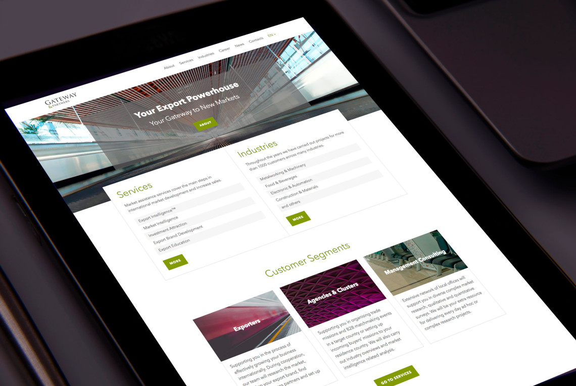
Formup breathed new, modern life into the Gateway & Partners website. Launching the site felt like putting on a new suit tailored just for us. It not only looks great but is more comfortable for visitors to use. Working together was a breeze as we listened to each other's wishes and solutions. The result both pleases the eye and elevates us to a new level.

Hamid Sadoni,
Co-Founder of "Sadoni"

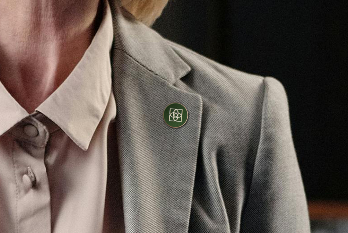
We were pleased to engage Formup to develop our logo, visual materials and website. Formup offers not only design solutions, but also great customer service. Easy to get in touch with and always 100% at your service.

Riga Porcelain museum

visual identity

Visual identity redesign for the Riga Porcelain museum. Identity consists of a few logo variations which are used contextually. It echoes with time when various marks were used on the products of a particular manufacturer to inform about quality, technique used etc. White (porcelain) and blue (cobalt) are deeply rooted in the history of porcelain looking back as far as 7-10th century China where the technique using cobalt on porcelain was perfected and used widely.

Latvia Expo 2017

Visual Identity

The development of the visual identity and printed materials for the Latvia pavilion at Expo 2017. The identity was based on the motto of the pavilion: “Meeting Point Latvia — Energy is in our nature”. Thanks to its advantageous geographical location, Latvia has been a meeting place between people, companies and countries for centuries — for as long as business has been done. New meetings — new energy.

Website for the biggest export services company in Latvia Gateway & Partners. The site is focused on presenting the company's mission, its services and testimonials from its clients without wasting visitors' time.

Visual identity and graphical material development for an exhibition about Riga between the middle of the 19th century and World War I — a period during which medieval fortifications were taken down and the city expanded rapidly. Creation of an eclectic logotype reminiscent of period advertisements which featured a great many different typefaces.

Sadoni

Visual Identity & Website

Visual identity, stationery, collateral material & web design for the Norwegian bridal dress company Sadoni. The company was first established as an exclusive couture atelier tailoring on order — this is reflected in the logotype through precise and delicate letterforms. Done in collaboration with Edgars Zvirgzdiņš.

Juris Boiko. Salt Crystals

Visual Identity

The development of the visual identity and printed materials for an exhibition dedicated to Juris Boiko. The exhibition features works that use salt — a material which the artist researched and with which he experimented. The visual identity is based on a salt crystal lattice structure, which can be adapted to various formats. The identity was developed in collaboration with Eva Abduļina.

FK Magazine

Logo, Editorial & Website

Logo, editorial & web design for FK Magazine — a medium which highlights Latvian and foreign contemporary documentary photography. The logo takes the shape of a box — a reference to a camera obscura, the precursor of the photo camera.

Packaging design for an anthology featuring compositions by young Latvian composers such as Ēriks Ešenvalds, Rolands Kronlaks and Santa Ratniece, performed by the Latvian Radio Chamber Singers. The cover design is a visual reference to a crop field but it can also be seen as representing sound waves.

Collection of essays in the form of text and photography by twenty authors from various professional fields who have devoted their work to Riga and Latvia or who through their work have touched on the problems characteristic of this place.