Formup offers tailored visual communication services. It is run by Artis Tauriņš who specialises in visual identity, print and UX/UI design. Driven by a work principle grounded in the research of clients values and users needs, which serves as the bedrock for the development of bespoke solutions.

Edurio

Digital

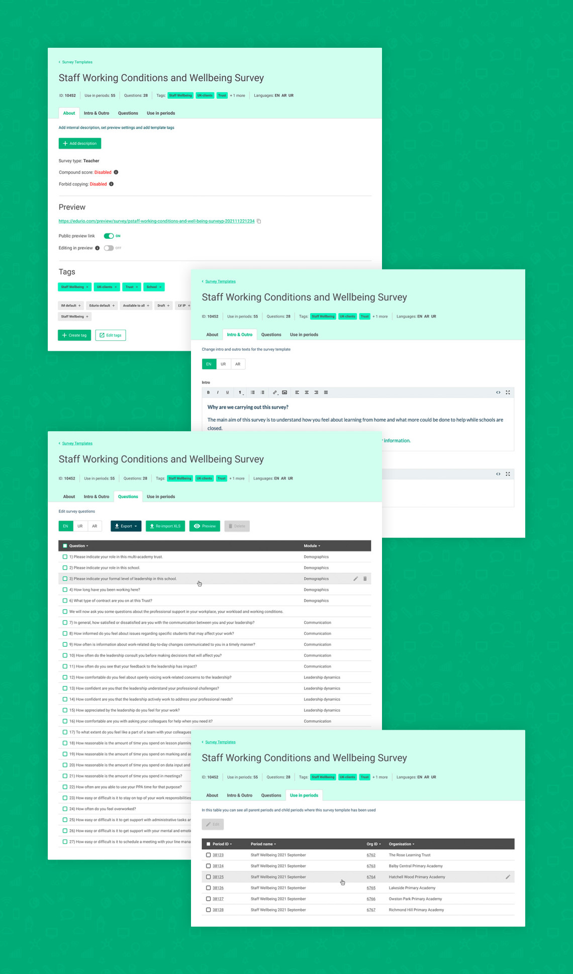
This was part of a larger admin tool UX and UI design overhaul aimed at making workflows more efficient, enabling customer managers to serve more clients without substantial increase in their workload. Through semi-contextual inquiries and interviews, key questions were addressed:

  1. What is missing and what is redundant?
  2. What is easy to use and what isn’t?
  3. What information and functions should be prioritized?

There were numerous UI issues that could be immediately addressed using established patterns, while others were solved through use case scenarios with users and discussing their experiences and needs:

  1. Poor hierarchy and placement of elements
  2. Scattered functions
  3. Unnecessarily space-consuming elements
  4. Rarely used parts taking space from essential ones
  5. Important functions and status messages below the fold
  6. Hard-to-scan list without sorting options

In the first attempt, some issues were resolved, such as hierarchy (1), unified button placement (2), reducing space for unnecessary elements (3), and moving important functionality above the fold (5). However, problems with all functions being crammed into one layout (4) and the inability to easily scan the list (6) remained.

A decision was made to fundamentally change the UI and some functionality. To address the remaining issues and align the admin tool's UI with the customer-facing product—already familiar to internal users—the header from the customer-facing UI was adopted, providing key information at a glance. Additionally, tabbed navigation was introduced to simplify access to various functions.

To achieve the final result, extensive collaboration with users was conducted through interviews, individual and group discussions on wireframes, and reviews of final designs before development to ensure alignment on every detail and meet expectations.

The System Usability Scale was used to measure impact before the redesign and again a month after the new version was launched, allowing users enough time to familiarize themselves with it. The initial score was 54, below the average of 68. After the redesign, the score improved to 78. User comments also highlighted that the new version was significantly easier and more enjoyable to use.

Other projects